A bold, unified image for reproductive dignity
Brand and website for the Sexual and Reproductive Justice Coalition, a small South African network with a big agenda.
The brand
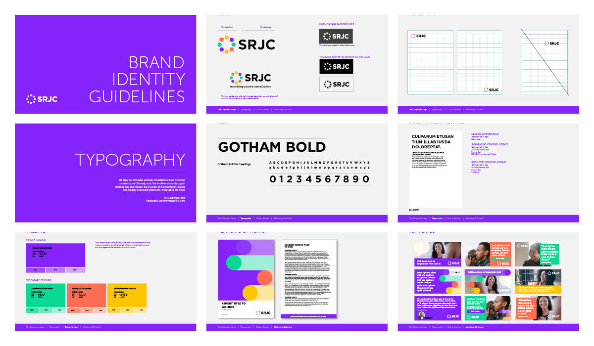
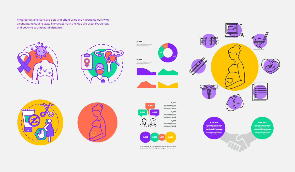
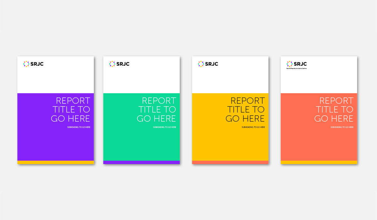
Circles for reproduction, support and working together, and four bold colours that give each focus area its own voice while keeping one coalition.
The need
Who they needed to reach
Policy makers, health service providers, member organisations, activists and the public in South Africa
What stood in the way
The Sexual and Reproductive Justice Coalition (SRJC) is a small South African network of organisations and activists working for a future in which all people make reproductive decisions and access services with dignity. It holds policy makers and health providers to account on abortion, contraception and HIV, the decriminalisation of sex work, queer health, and young people's sexual and reproductive health and rights. Its issues are sensitive and its team is small, but it has to compete for attention with much larger organisations, and its old identity did not reflect what it stood for.
What success looked like
A coalition that looks as credible and confident as any large organisation, with tools its small team can use every day without outside help.
How we met the need
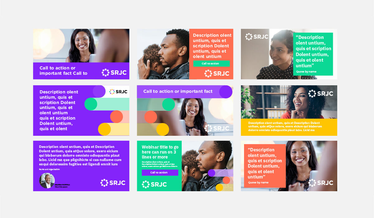
We treated SRJC like any of our larger clients, but sized the work to fit a small network. One complete overhaul gave it a brand, a website and a set of ready-to-use templates, so the team could produce reports, emails and social media posts that look professional without needing a designer each time. The new logo is built from circles that reflect reproduction, support and working together, in strong, dramatic colours that will not be overlooked.
The process
Small organisations often do some of the most important work, with the least to spend on how they look. The Sexual and Reproductive Justice Coalition is a good example: a small South African network working on abortion access, contraception and HIV, the decriminalisation of sex work, queer health, and young people’s rights. These are sensitive issues that need to be heard by policy makers and health providers, and the coalition has to make its case alongside much larger organisations.
SRJC asked us to oversee a complete overhaul of its visual identity. We approached it the way we approach work for any client, starting with what the coalition stands for and who it needs to reach, but we sized it to fit a small team: one project, one clear brand, and tools they could use on their own.
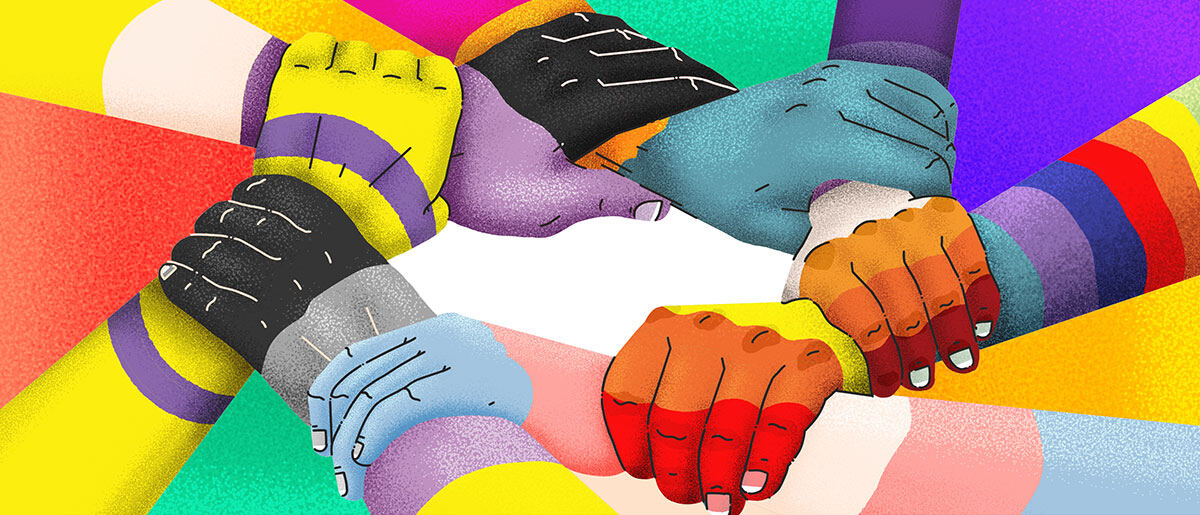
The logo is built from circles that reflect reproduction, support and working together, in strong, dramatic colours. Each of the four colours can lead a focus area, so the brand flexes across topics while staying recognisably one coalition. An illustration of many hands joined in a circle carries the same idea into images.
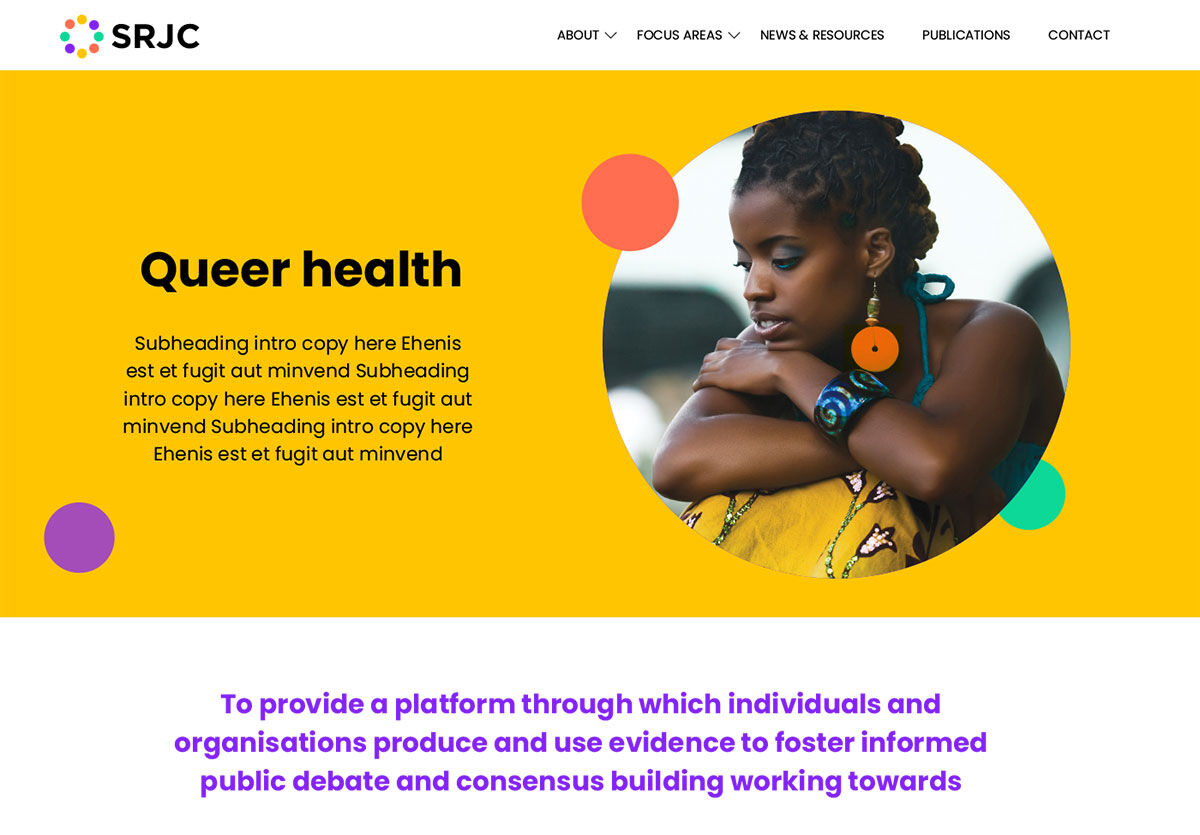
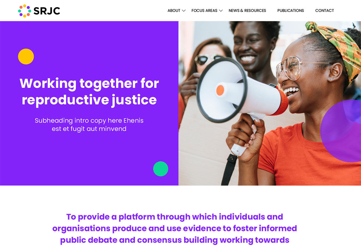
We then built the new website around the coalition’s focus areas, news and publications, and a full set of templates for reports, documents, email and social media. The result is a small organisation with a big presence, and the means to keep it up.
What the client got
Big-organisation quality, sized for a small network
The coalition presents a bold, unified image across every communication tool, one that promotes inclusivity and holds its own beside much larger organisations. Its small team can publish news, reports and campaign material themselves, in a consistent style, without design support for every piece.
Visit the live site ↗